If you know me at all, you’ll know that I always have to be doing something. I’m constantly looking for new challenges and skills that I can add to my toolbelt. When I first started at Shopify, their onboarding session talked about T-shaped people and the growth mindset. I had never really come across the terminology before, but I immediately recognized a lot of it in myself. T-shaped people are those who have a fundamental skill that is their career, their craft, their bread and butter, and that makes up the root of the T. The outer portions are the other skills that they’ve learned along the way. For myself, my root is my design craft, however along the way I’ve tried to broaden my T by diving into photography, cinematography and video, motion design, music, and the world of 3D.
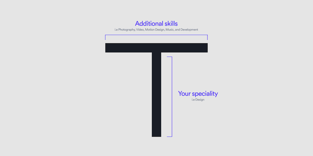 Visual explaining the structure of the T-shape
Beyond just the alignment of having a growth mindset, Shopify believes that everyone should be dev literate. I agree with this sentiment wholeheartedly. You don’t need to fully learn how to code, but you should understand the fundamentals. For example, designers who understand development basics can help the collaboration process immensely, just by understanding the feasibility of some of their designs. The future isn’t straying from technology, so the more you can broaden your T to help equip yourself with the right tools, the more successful you can be.
Danielle and I used to use a spreadsheet to track all of our shared expenses like groceries, mortgage, bills, etc. and it got pretty complicated and hard to maintain when it came to which items were paid by which transfers. Instead of trying to improve the spreadsheet, and living by my internal motto of:
“If something is worth doing, it’s worth overdoing”
I took it as an opportunity to build an app to track all of it and learn more about development in the process. I used to do a fair bit of development back in the days of PHP, so this was more of a way to modernize my development skills.
I started with database modeling, trying to figure out how everything relates to each other and the best way to store the information. It helps when you already have a few months of spreadsheet data to help figure it out. I won’t go too much into the details, but at a very top level - bills contain the information for the expense and they get connected to transfers once they’ve been marked as paid.
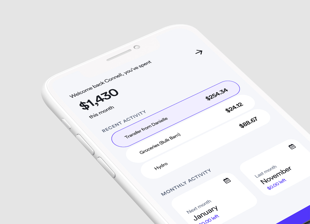
After I had a layout for the database, I started diving into the UX of the app in Figma. I explored what I needed to do to add a new expense, create a transfer, or check in on how much we’re spending. I’ve had this design system aesthetic in my head for a while now, and I’m super excited to implement it on a real product.
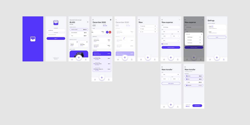 Figma board with app design screens.
A fun little fact about the rationale behind the logo is that while it looks like a wallet, it was designed to mimic the shape of the bottom tab bar from the app UI.
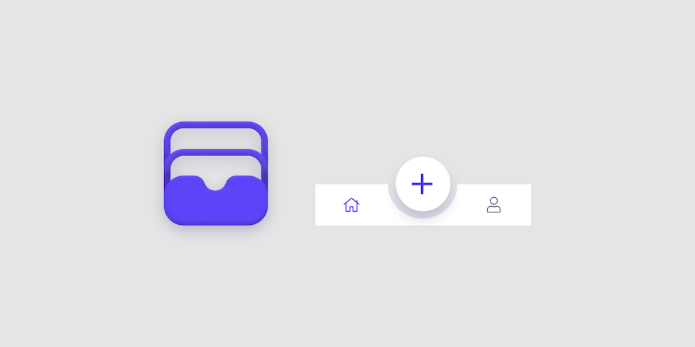 One Bill logo next to the app’s bottom tab bar.
After the mocks were done I had a general understanding of the views required and went to work making them real. I figured starting in Node JS with an Express app would be best since I already have a basic understanding of Javascript, but I also wanted to use this as a way to dip a toe in the water before diving into Rails, and React. A few CLI commands and the express app was running out of the box. I decided to use Pug as the front end language since I had used the previously named version, Jade, a year or two ago. It’s essentially HTML without the brackets and closing tags. It’s great for fast and clean code since everything is nested and concise, but it did present some issues with the transfers section of the monthly view.
The monthly view was going to be the biggest lift of the app, so that’s where I started. I figured a lot of the data I pulled would be reusable on the index page, and the transfer select page. I originally started with trying to use MongoDB as the home for the data but trying to learn the aggregation portion of it was making me lose my hair. I figured learning more about Node outweighed learning about Mongo, and I returned to SQL for the database management.
I was amazed at how quickly things were coming together; javascript is pretty intuitive, so everything seemed to go pretty smooth. I did run into an issue with Pug when it came to nesting a condition. Essentially my query returns the block of data for the transfers along with the items the transfer contains. My way of separating the data is by saving the transfer id, and detecting if it’s changed. If it’s a new id it should render the top portion of the transfer. This logic worked out nicely when it came to just printing stuff on the page. When it came to designing it, however, it created a flaw. I wanted each transfer and its items to be inside a container with rounded corners. The easiest way to do that in CSS is by using the last-child selector, but the problem was knowing when a transfer had closed. I had to do some hacky logic that essentially set a status of if we were at the start, create a div that wrapped all the content, and if it wasn’t the start, close the div. That worked, but the error in that is that for the last item, the closing tag was never called. I had to create another hacky solution where it detected if it was the last item in the array, and if it was, close the tag.
core/views/monthly/index.pug
if transfers.length
  h4.mb-1.muted Transfers
  -var current_transfer;
  -var last_item = transfers[transfers.length -1];
  -var start = true;

  each item in transfers
    -if (current_transfer != item.transfer_ref) { //If it's a new transfer, handle the transfer head block
      -if (start) {
        -start = false;
      -} else { //If it's not the first item of the data, close the div
        | </div>
      -}

      | <div class="transfer_container"> //This is the container that groups each individual transfer together, and allows for rounded corners
      -current_transfer = item.transfer_ref
      //Create the transfer information block
      .transfer.head.mt-5
        .info
          p.m-0.accent-light.s-small #{prettyDate(item.transfer_date)}
          p.m-0.w-medium.mt-1 Transfer from #{item.from_label}
        .amount
          p.s-medium.w-medium.m-0.mb-1 $#{prettyNumber(item.transfer_amount)}
    -}
    //A regular expense paid by the transfer
    .transfer.item
      .info.flex
        .icon
          i.fas.fa-check-circle.accent.s-large
        .text.ml-2
          p.muted.m-0 #{prettyDate(item.date)}
          p.m-0 #{item.label}
          p.accent.m-0 #{item.split}% of $#{prettyNumber(item.amount)}
      .amount
        p.w-medium.m-0.mb-1 $#{prettyNumber(item.amount_split)}

    -if (item == last_item) { //If it's the last item in the array, close the div
      | </div>
    -}
I feel like if I was using a different language, this would be much simpler but Pug is very particular about the formatting being how it closes and opens tags. As you can also see, I created my stylesheet to be set up as a modular framework, so that I would spend less time writing custom CSS and have it match the designs I made quicker.
I went on to build out the creation forms, allowed for saving entries as templates for those recurring expenses, and tried making the transfer portion as seamless as possible. Seeing as we’ve never transferred the total all at once, I wanted us to be able to select individual items for the transfers and have it calculate the total needed to send over.
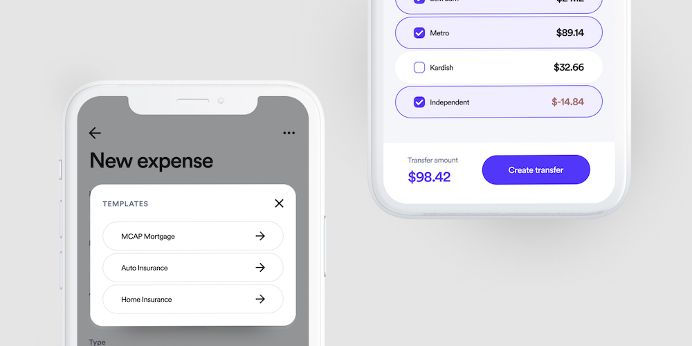 Create new expense view with the saved templates popup, and the select expenses view of a new transfer.
I tried to make it feel as much like an app as possible, so I used loading screens and fetched the new content via an Ajax library called smoothState. It was super helpful in creating a seamless experience between views. I used req-flash to manage my success/error toasts and even built out a Redis server for managing user sessions. That means there’s an opportunity to make this scale. :eyes:
I designed it to be a full format mobile app, so I dusted off the old Xcode and set up a simple WKWebView app so I had more control over the interactions, alerts, and push notifications (in the future) rather than a bookmarked site.
Here’s a little demo of it so far.
I learned a lot more than I anticipated going into this, so I highly recommend anyone out there to do something similar yourself. Take some time to broaden your T, and become more literate in a field you’re interested in. Send me a note on Twitter with feedback, improvements, ideas, etc. I’d love to hear them.