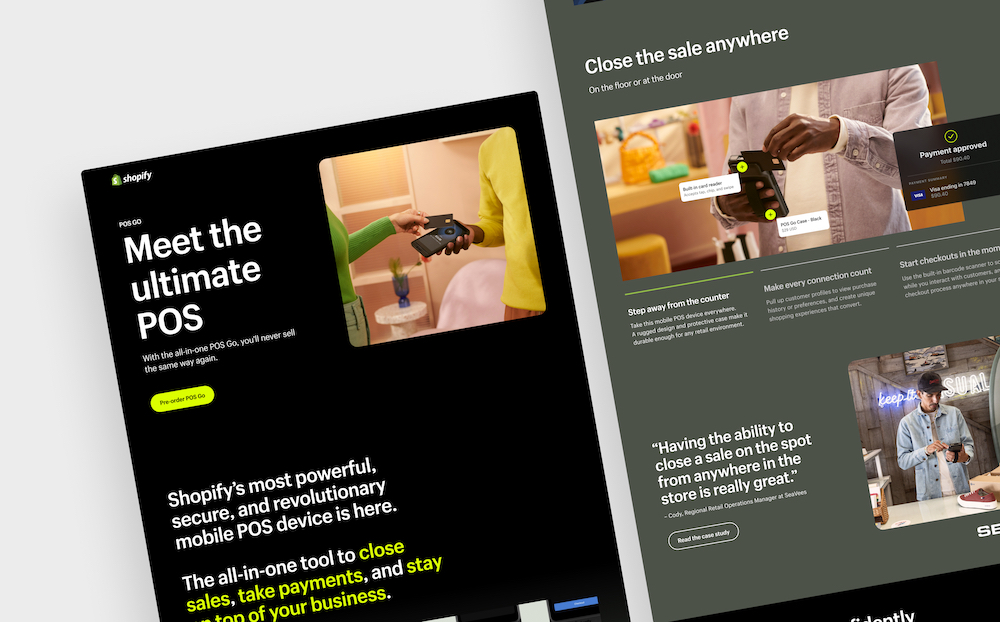
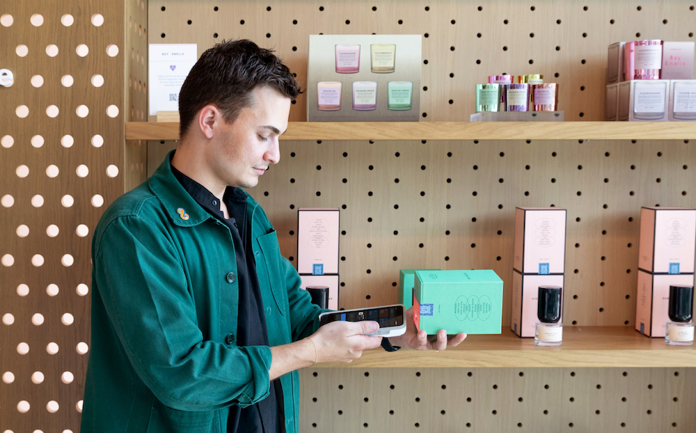
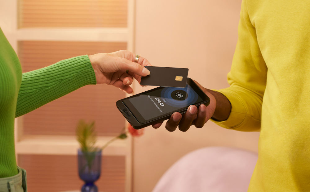
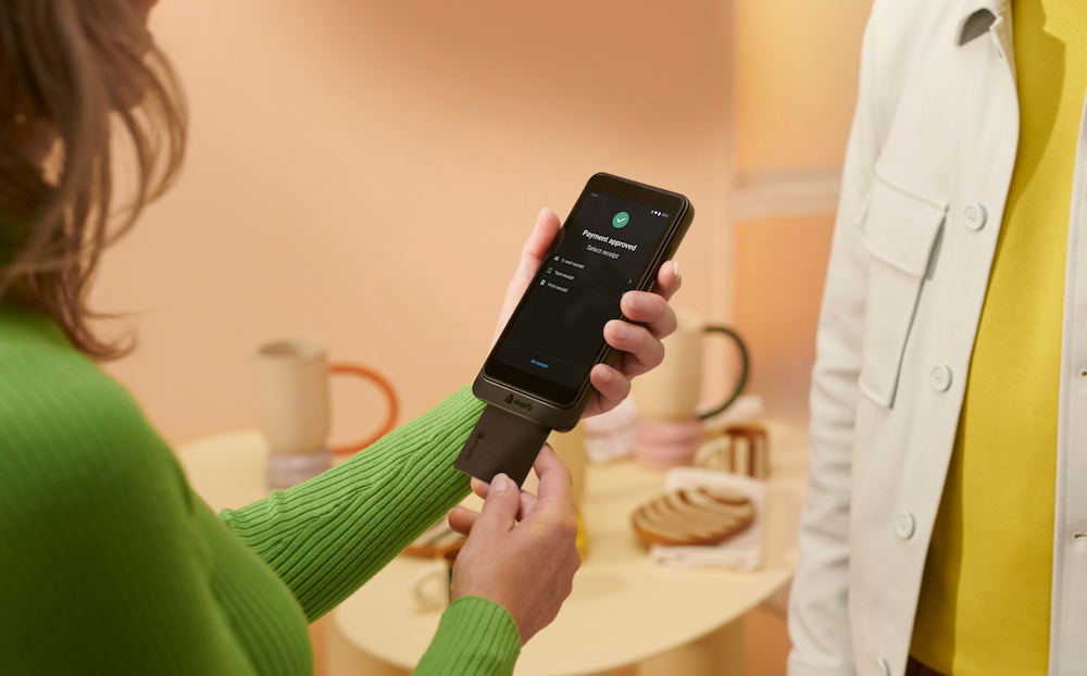
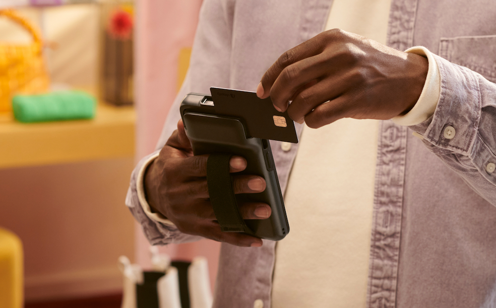
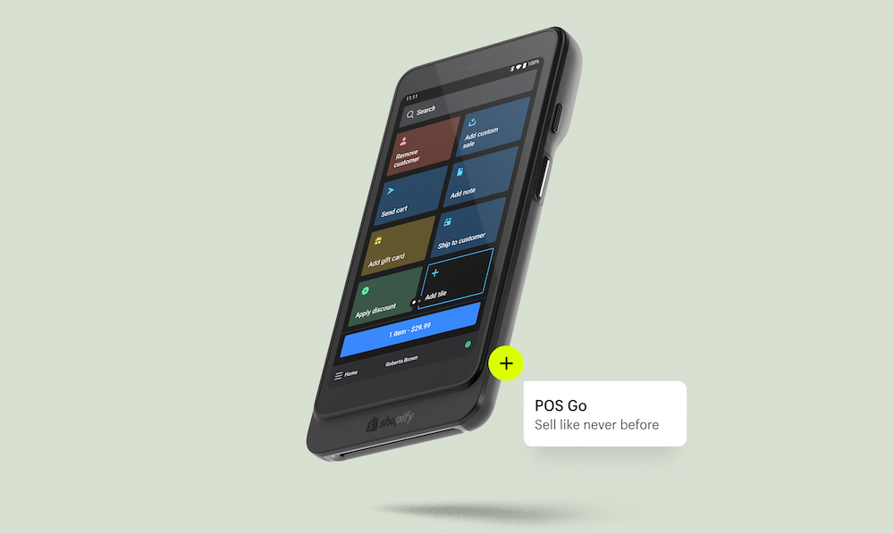
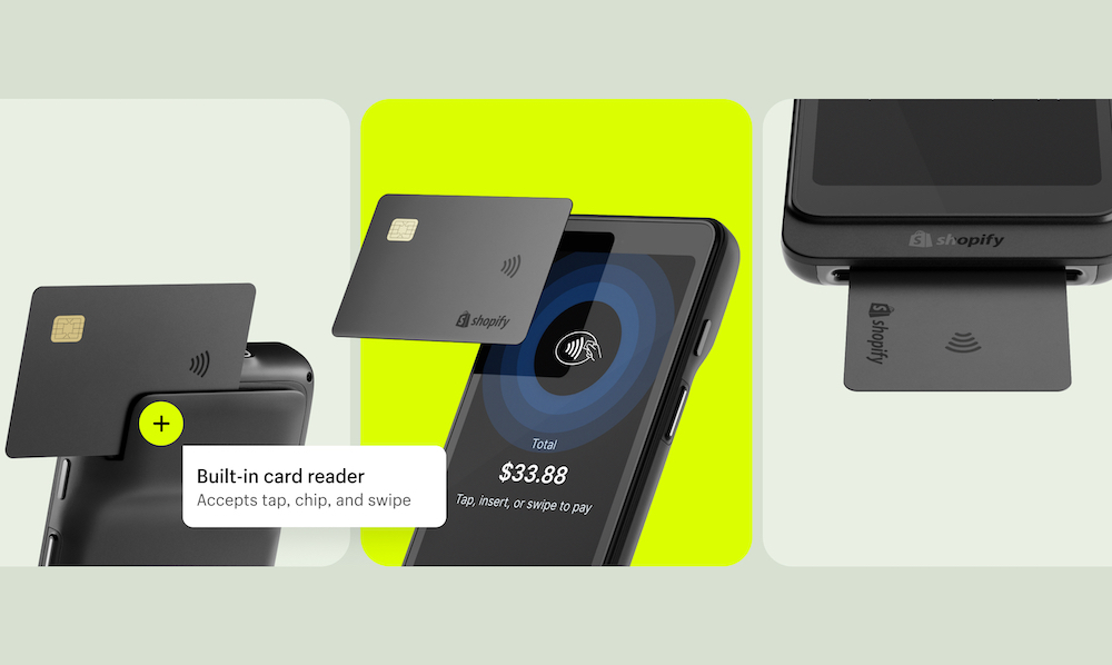
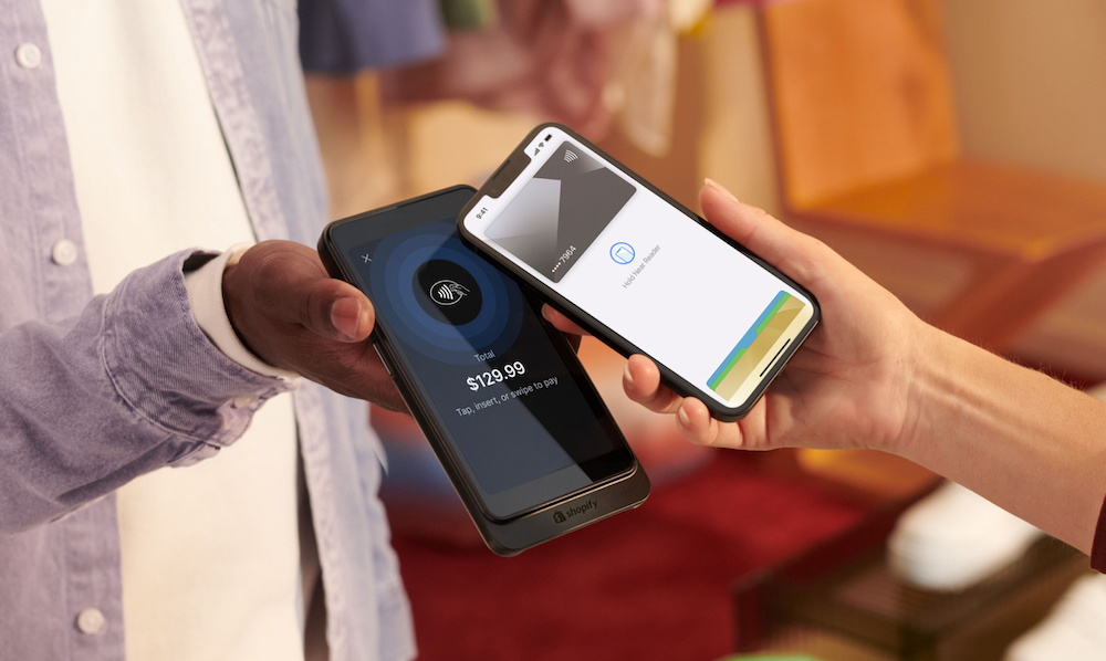
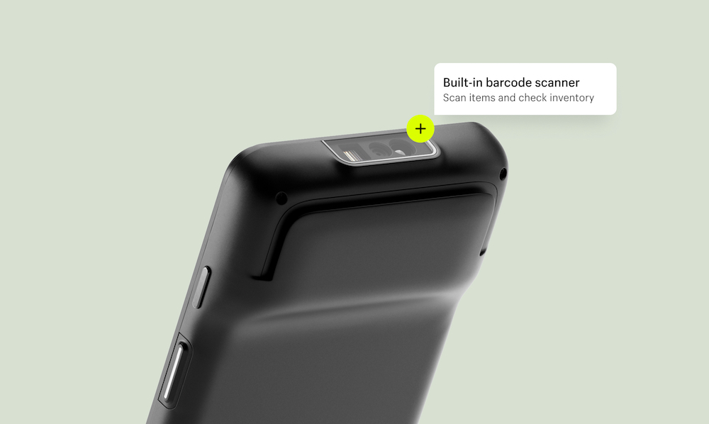
I had the opportunity to work on the go-to-market campaign for the latest Shopify product launch, POS Go - the all-in-one mobile POS system built for seamless store checkouts.
Creative direction
This campaign has been a long time coming with a couple speed bumps along the way, but even with the challenges we faced, the team stayed resilient and motivated to create a beautiful campaign. We wanted a creative direction that felt in line with the rest of our brand, but also something that could stand as a moment in time.
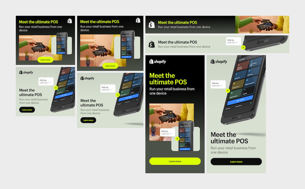
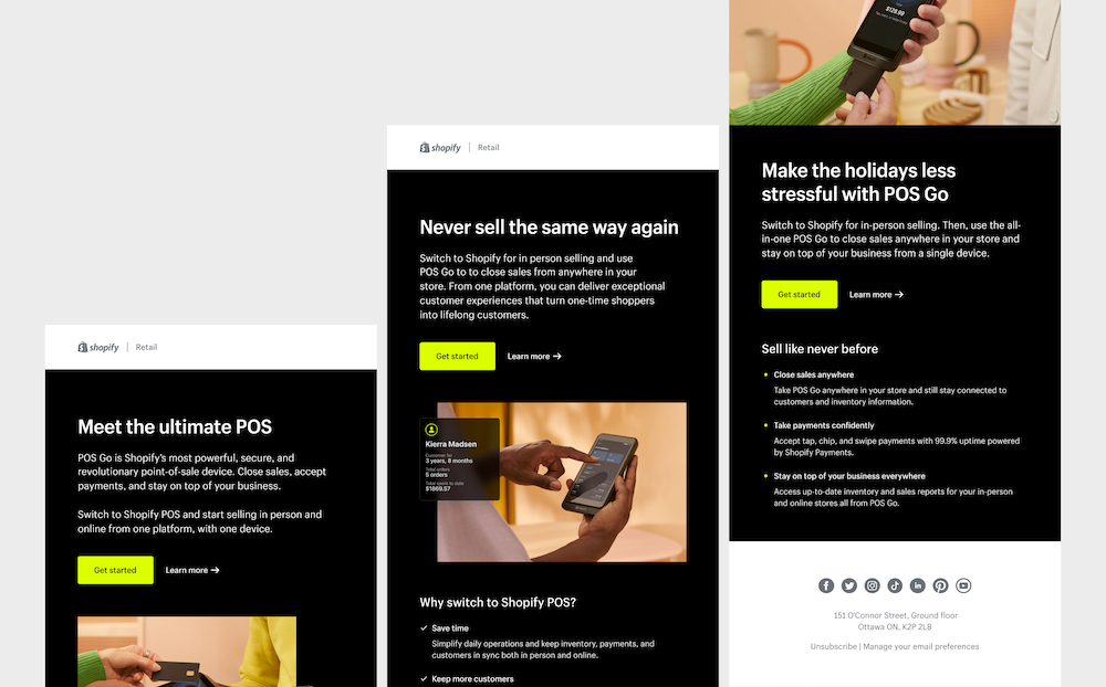
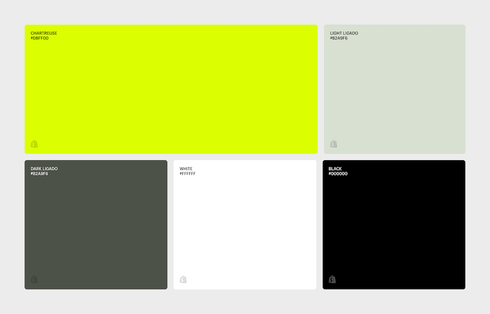
The colour palette was the piece of the campaign that brought it all together. We used grounded and warm neutral colours as the main pillars to keep it approachable, while pairing them alongside chartreuse to add the boldness it needed.
We prioritized applying the campaign creative to the landing pages first, so that we could see it all together in one place, and then take pieces of it and repurpose it for other touchpoints like ads, direct mail, paid social, and emails.
Photography
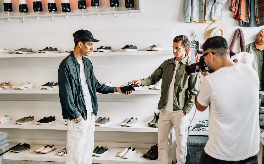
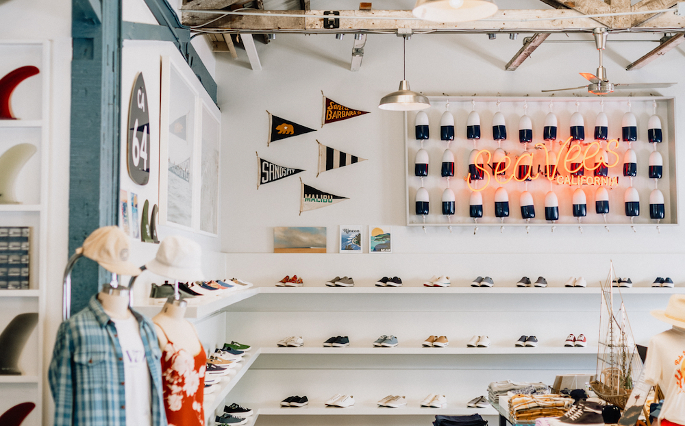
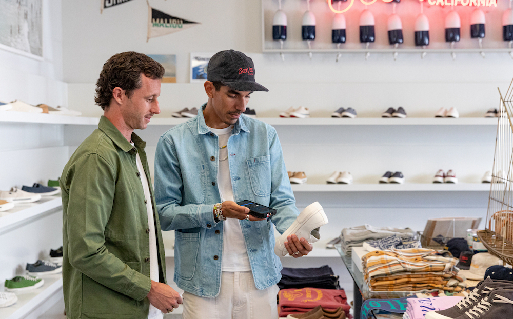
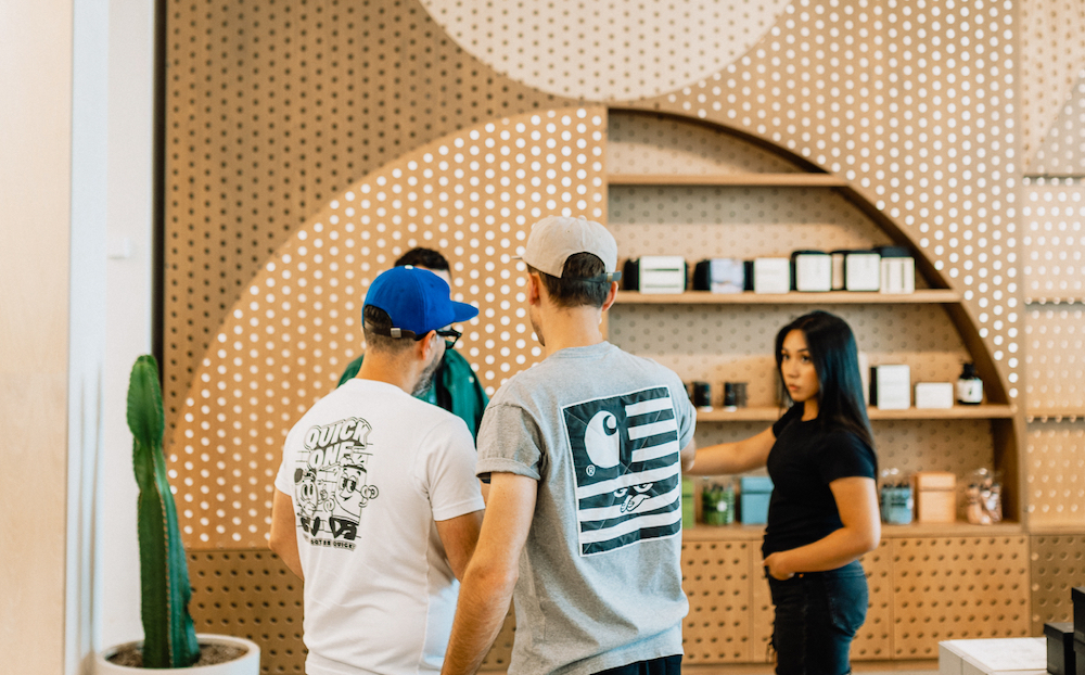
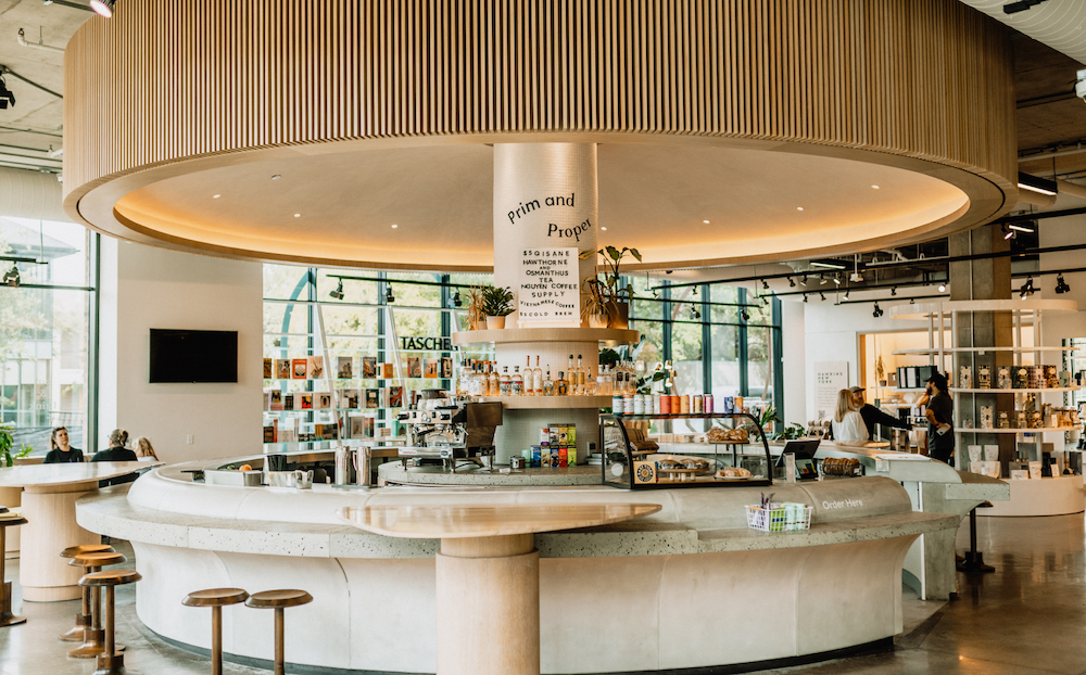
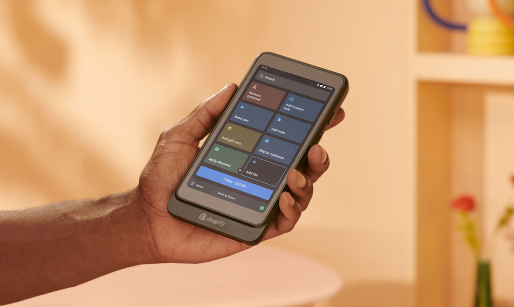
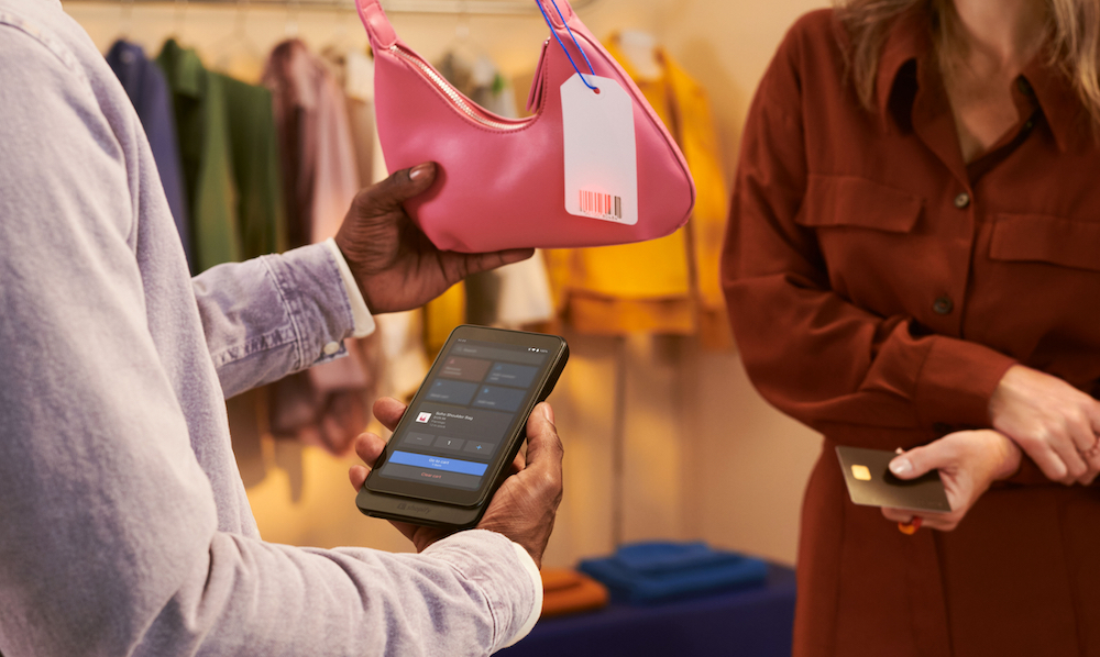
We worked together with two merchants who were part of the beta program to take some product and lifestyle photography of the POS Go in action. We partnered with SeaVees, a shoe brand based out of Santa Barbara, California, and Neighborhood Goods, a new type of department store in Austin, Texas.
I had a jam-packed itinerary starting with a flight to Toronto in the morning to meet up with the team, and then a flight to Los Angeles. Once we landed, we rented a car and proceeded to make the two-hour drive to Santa Barbara. A brief stop along the coast for In-N-Out, we made it to Santa Barbara just after sundown. The shoot was the following morning, and by that afternoon we were on the road again back to Los Angeles so we could catch our flights to Austin.
Working with merchants in their environment is always an amazing experience. You get real-time feedback about what kind of pain points they have with our products, and you come back feeling inspired to make the experiences better for them.
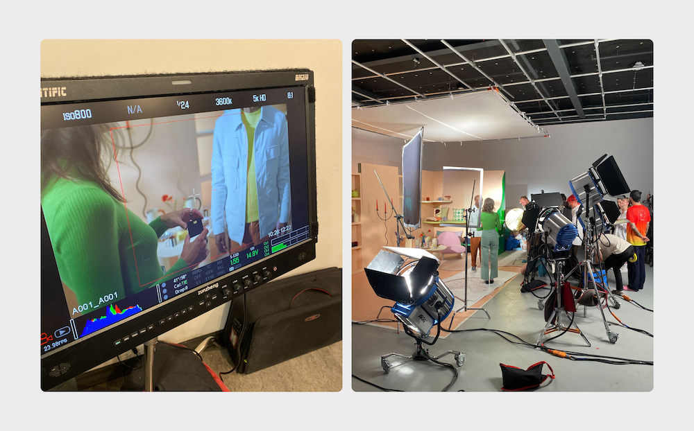
The next week, the team had a studio shoot in Montreal with L’Éloi to create the leading photography for the campaign. Stylized in a warm palette, with natural lighting and soft shadows, allowed it to balance the neutrals and black backgrounds we were using across marketing touchpoints.
Promo video
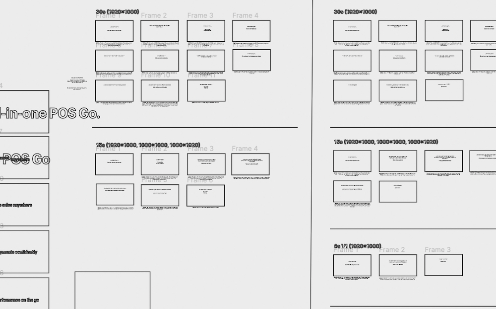
We knew we needed to create a promo video that really brought the energy and impact that matched the scale of this product launch. In order to do that, we needed to get bold with the copy and with the pace of the animations. With such a short amount of time to communicate everything we wanted to touch on, the words on screen needed to be as short and descriptive as possible. Storyboarding took a few iterations to fine tune the messaging and tone, but once that was finished it was onto the music.
Outside of my day job, I make music under the artist name COVEO, and I always try to bring those skills into my day-to-day work when needed. I had previously made a custom track for the Inbox launch campaign, and the team was excited to do something similar for this project.
We had an initial direction based on a Jamie xx track, but it ended up being too dark for the general audience.
SHOP_POS_GO_PROMO_V4
Inspired by LCD Soundsystem, I ended up making a brand new iteration while in a hotel room in Austin which the team thought was a better fit. The approachable sound paired with our visuals ended up blending together perfectly.
SHOP_POS_GO_PROMO_V5
As the video progressed, I kept refining the sound and composition until it had enough variation to not be repetitive, and sound as polished as we could get it.
I couldn’t have asked for a better team to collaborate with. From product, to hardware, to marketing - everyone had such a passion to create the best campaign possible and it was truly inspiring.
Credits
Thanks to everyone who helped make this campaign what it is.
Collaborators
Shannon Murphy
Content Design Lead
Nicolas Tual
Design Lead
José Silva
Senior Designer
Caroline Gonzales
Senior Designer
Tasha Dennis
Senior Content Designer
Melody Cheung
Project Marketing Manager
